
Be honest: how many times this week have you reached for a useEffect hook, a ResizeObserver, or drilled props through three layers of components just to change a background color or adjust a layout?
If you are building modern web applications in 2026, the answer is probably "too often." And it is driving up our bundle sizes, complicating our mental models, and introducing unnecessary rendering cycles.
We as an industry developed a collective habit around 2018. Because CSS lacked specific logic features, we bridged the gap with JavaScript. We built massive CSS-in-JS libraries. We created global state contexts just to let a parent component know that a child input was focused. We wrote custom scrolling hooks that fired on every frame and subsequently destroyed our Lighthouse performance scores.
But here is the reality check for 2026: CSS grew up while we were busy writing custom React hooks.
Think of it like buying a massive, expensive Swiss Army Knife because you really need the scissors. You carry this heavy block around (JavaScript) when an actual, dedicated pair of lightweight scissors (Modern CSS) has been sitting on your desk the entire time.
Today, native CSS features that were previously hidden behind experimental browser flags have reached widespread Baseline support. They are no longer risky bets for bleeding-edge side projects—they are production-ready tools that can eliminate entire classes of JavaScript utility files from your codebase.
In this comprehensive deep dive, we are going to look at the exact JavaScript patterns you should stop writing today, and the native CSS alternatives that replace them perfectly.
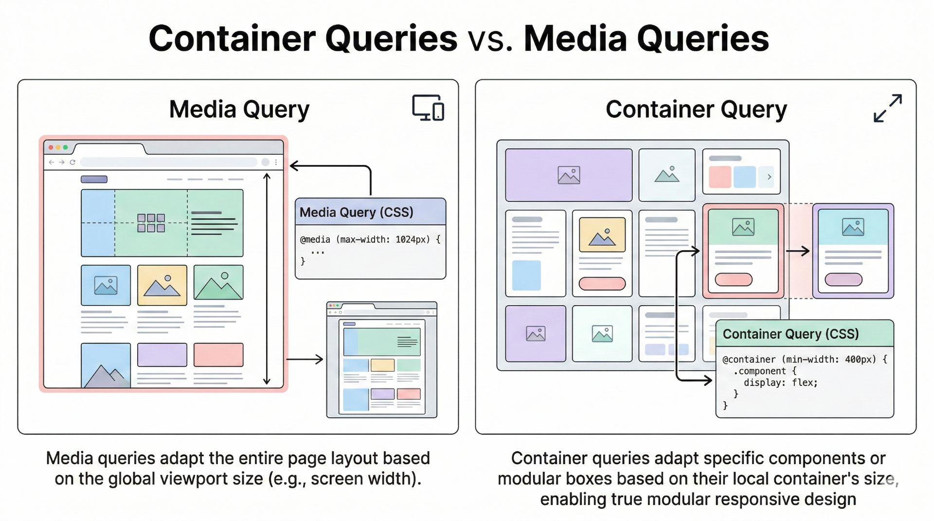
Stop Using JavaScript for Component Sizing: The Era of Container Queries
For over a decade, Responsive Web Design relied exclusively on Media Queries (@media (min-width: 768px)). Media queries are brilliant, but they have one massive, architectural flaw: they only care about the viewport size.
In the component-driven era of React, Next.js, and Vue, components don't live in isolation. A Card component might be placed in a wide hero section, or it might be squeezed into a narrow <aside> sidebar. If your layout rules depend on the screen size, the component breaks when placed in a tight container on a wide screen.
To solve this, we historically reached for JavaScript. We used ResizeObserver to track the actual DOM element's width, shoved that width into component state, and triggered re-renders based on the layout math.
The Old Way: Bloated React Hooks
Let's look at the pain we used to endure to make a truly granular component:
javascript// The Old 2022 Way ❌
import { useEffect, useRef, useState } from 'react';

export function ResponsiveCard({ title, content }) {
  const containerRef = useRef(null);
  const [layout, setLayout] = useState('stacked'); // 'stacked' or 'row'

  useEffect(() => {
    if (!containerRef.current) return;

    const observer = new ResizeObserver((entries) => {
      for (let entry of entries) {
        // We are triggering a React render cycle just for layout adjustments!
        if (entry.contentRect.width > 400) {
          setLayout('row');
        } else {
          setLayout('stacked');
        }
      }
    });

    observer.observe(containerRef.current);
    return () => observer.disconnect();
  }, []);

  return (
    <div
      ref={containerRef}
      className={`card ${layout === 'row' ? 'card-row' : 'card-stacked'}`}
    >
      <img src="..." alt="" className="card-image" />
      <div className="card-body">
        <h3>{title}</h3>
        <p>{content}</p>
      </div>
    </div>
  );
}
This is terrible for performance. Every time the user resizes the window, the ResizeObserver fires, state updates, React runs a diff algorithm, and the DOM is patched. For a visual layout change!
The New Way: CSS Container Queries (@container)
In 2026, Container Queries completely eliminate this pattern. You tell a parent element to become a "container," and then children style themselves based on the width of that specific container—ignoring the viewport entirely.
html<!-- The Clean 2026 Way ✅ -->
<div class="card-wrapper">
  <div class="card">
    <img src="..." alt="" class="card-image" />
    <div class="card-body">
      <h3>Title</h3>
      <p>Content</p>
    </div>
  </div>
</div>
css/* Step 1: Define the containment context */
.card-wrapper {
  container-type: inline-size;
  container-name: card; /* Optional, but good for nested containers */
}

/* Default mobile/narrow styles */
.card {
  display: flex;
  flex-direction: column;
  gap: 1rem;
}

/* Step 2: Query the container, not the screen! */
@container card (min-width: 400px) {
  .card {
    flex-direction: row; /* Switches to a row layout regardless of screen size */
    align-items: center;
  }

  .card h3 {
    font-size: 1.5rem;
  }
}
The Result:
- Zero JavaScript overhead.
- Zero React re-renders for layout adjustments.
- Truly reusable components that look perfect regardless of where you drop them in your application tree.
The Parent Selector We Waited Two Decades For: :has()
If there is one CSS feature that single-handedly kills the need for complex state management, it is the :has() pseudo-class.
For 20 years, CSS could only style downwards. You could style a child based on its parent (.parent:hover .child), but you could never style a parent based on its child.
This directional limitation forced developers to invent crazy JavaScript workarounds. Imagine a form group containing an input and an icon. If the input is focused, or if the input fails validation, you want the entire wrapper to turn red and glow.
The Old Way: Lifting State is Exhausting
Because CSS couldn't look "up," we had to use React state simply to track the interaction and apply a class to the parent wrapper.
javascript// The Old 2022 Way ❌
import { useState } from 'react';

export function FormGroup() {
  const [isFocused, setIsFocused] = useState(false);
  const [hasError, setHasError] = useState(false);

  const handleBlur = (e) => {
    setIsFocused(false);
    setHasError(e.target.value.length < 5);
  };

  return (
    <div
      className={`form-wrapper ${isFocused ? 'focus-ring' : ''} ${hasError ? 'error-ring' : ''}`}
    >
      <svg className="icon" />
      <input
        type="text"
        onFocus={() => setIsFocused(true)}
        onBlur={handleBlur}
      />
      {hasError && <span className="error-text">Too short!</span>}
    </div>
  );
}
You are tracking focus and blur events in Javascript memory, triggering React renders on every keystroke or click, just to make a border blue. This violates the separation of concerns: interaction styling belongs in CSS.
The New Way: The :has() Revolution
The :has() selector asks a simple question: "Does this element contain something that matches this selector?" And it does it with zero JavaScript.
html<!-- The Clean 2026 Way ✅ -->
<div class="form-wrapper">
  <svg class="icon" />
  <input type="text" minlength="5" required />
  <span class="error-text">Too short!</span>
</div>
css/* Base styles */
.form-wrapper {
  border: 2px solid var(--gray-200);
  transition: border-color 0.2s;
}

/* Style the parent wrapper if ANY input inside it is focused */
.form-wrapper:has(input:focus) {
  border-color: var(--blue-500);
  box-shadow: 0 0 0 3px var(--blue-100);
}

/* Style the parent wrapper if ANY input inside it is invalid */
.form-wrapper:has(input:invalid:not(:placeholder-shown)) {
  border-color: var(--red-500);
  background-color: var(--red-50);
}

/* Change icon color based on sibling input state! */
.form-wrapper:has(input:focus) .icon {
  fill: var(--blue-500);
}
The power of :has() cannot be understated. You can use it to build dynamic navigation menus, conditional grid layouts, and complex form validations entirely natively. It is a paradigm shift in how we write UI.
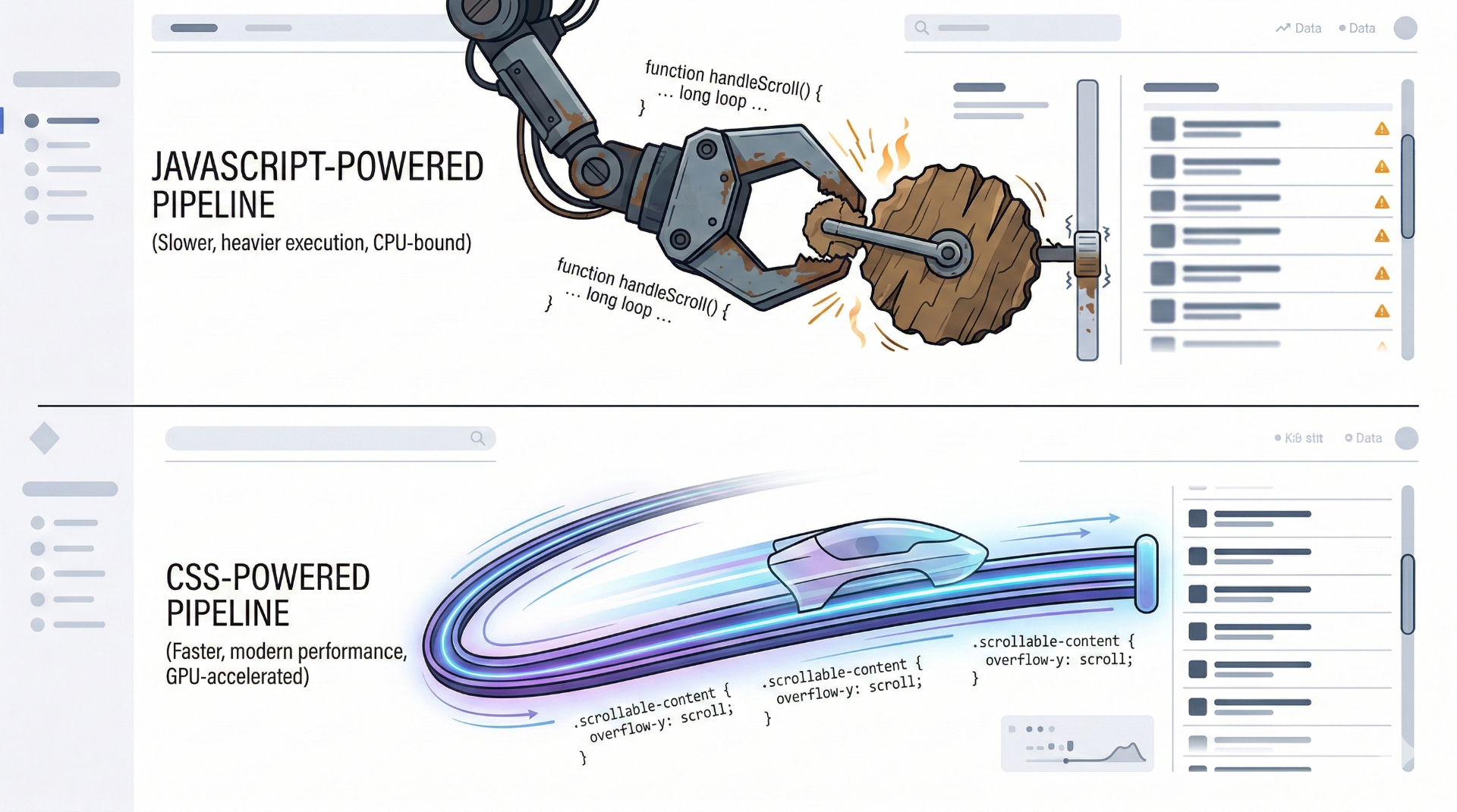
Scroll-Driven Animations: Retiring IntersectionObserver
Scroll animations have always been the bane of frontend performance. Parallax effects, reading progress bars, and elements fading in on scroll usually require listening to the scroll event.
The standard approach was using an IntersectionObserver or a scroll listener hooked into requestAnimationFrame. Even with the neatest abstract React hooks, reading window.scrollY or element.getBoundingClientRect() repeatedly causes layout thrashing and jank, especially on mobile devices.
Let's look at the classic "Reading Progress Bar" (like the one spanning the top of this blog!).
The Old Way: Heavy Event Listeners
javascript// The Old 2022 Way ❌
import { useEffect, useState } from 'react';

export function ReadingProgress() {
  const [progress, setProgress] = useState(0);

  useEffect(() => {
    const handleScroll = () => {
      // Forcing the browser to calculate geometry on scroll
      const totalHeight = document.body.scrollHeight - window.innerHeight;
      const progressPercent = (window.scrollY / totalHeight) * 100;
      setProgress(progressPercent);
    };

    window.addEventListener('scroll', handleScroll, { passive: true });
    return () => window.removeEventListener('scroll', handleScroll);
  }, []);

  return (
    <div
      style={{ width: `${progress}%` }}
      className="fixed top-0 left-0 h-1 bg-blue-500 z-50 transition-none"
    />
  );
}
The New Way: animation-timeline
CSS now natively supports driving animations based on the scroll position of the document or a specific container. It is buttery smooth because it happens entirely off the main thread, directly via the browser's compositor.
html<!-- The Clean 2026 Way ✅ -->
<div class="reading-progress-bar"></div>
css/* 1. Define a normal keyframe animation that goes 0 to 100% */
@keyframes grow-progress {
  from { transform: scaleX(0); }
  to { transform: scaleX(1); }
}

.reading-progress-bar {
  position: fixed;
  top: 0;
  left: 0;
  height: 4px;
  width: 100%;
  background: var(--blue-500);
  transform-origin: 0 50%; /* Grow from left to right */

  /* 2. Link the animation to the scroll position! */
  animation: grow-progress auto linear;
  animation-timeline: scroll(root block);
}
Three lines of CSS. No .js file, no useEffect, no layout thrashing. Just hardware-accelerated perfection. You can apply animation-timeline to parallax scrolling, revealing elements as they enter the viewport (view()), and complex sticky header transitions.
Popovers and Anchors: The Death of Z-Index Wars
If you have ever implemented a custom tooltip, dropdown menu, or floating select box, you know the pain.
First, you deal with z-index stacking context issues where your tooltip gets hidden behind a random sticky header. Then you realize you have to calculate the exact X and Y coordinates using JavaScript, handling edge cases where the tooltip flips directions if it gets too close to the edge of the screen.
Usually, developers surrender and run npm install @floating-ui/react adding chunks of library overhead.
Welcome to the Popover API and CSS Anchor Positioning
Native HTML and CSS now solve this entirely using the popover attribute and Anchor Positioning.
html<!-- Native HTML Popover -->
<button popovertarget="my-menu">Open Settings</button>

<div id="my-menu" popover>
  <ul>
    <li>Profile</li>
    <li>Log Out</li>
  </ul>
</div>
With just the popover attribute:
- It automatically gets promoted to the Top Layer of the browser (above all
z-indexvalues). - It natively supports "light dismiss" (clicking outside closes it).
- It handles focus trapping automatically for accessibility.
But how do you position it next to the button that opened it without using JavaScript to calculate coordinates? CSS Anchor Positioning.
css/* Tell the button it is an anchor point */
button[popovertarget="my-menu"] {
  anchor-name: --settings-btn;
}

/* Position the popover relative to the anchor */
#my-menu {
  position-anchor: --settings-btn;

  /* Place the bottom of the popover at the top of the button, with a gap */
  bottom: anchor(top);
  margin-bottom: 8px;

  /* Align the horizontal centers */
  justify-self: anchor-center;

  /* Provide fallback positions if it hits the edge of the screen! */
  position-try-options: flip-block;
}
This is mind-blowing. The browser guarantees it floats above everything else, calculates the position natively, handles opening/closing clicks, and automatically flips the tooltip if the window is too small. Zero JavaScript calculations required.
Common Mistakes When Adopting Modern CSS
As you transition away from these old JavaScript patterns, keep an eye out for these common pitfalls:
1. The "But what about Safari 14?" Myth
A common knee-jerk reaction is assuming these features aren't supported. In 2026, most of these features (Container Queries, :has()) have been supported for years across all major browsers. Keep track using the Baseline badge on MDN. Unless you are building legacy banking software for archaic systems, you can use these today. Don't punish 95% of your users with heavy JS bundles because 5% are on deprecated browser versions.
2. Over-engineering :has()
Because :has() is so powerful, it's tempting to traverse massive chunks of the DOM (body:has(.my-deep-modal-open) .some-random-footer). While browser engines are highly optimized, extremely broad :has() queries that check thousands of descendants can introduce layout performance hits. Scope your :has() selectors close to the component they affect.
3. Mixing Paradigms Unnecessarily
If React is holding the state of a checkbox, and onChange is triggering API calls, keep using React. Don't try to hack API state into CSS using invisible checkboxes and :checked pseudo-classes just for the sake of avoiding JS. Use CSS for Visual UI State (hover, focus, layout, scroll, visibility). Use JS for Application Data State (fetching, calculating totals, user permissions).
The Rule of Thumb for 2026
We spent years cramming everything into JavaScript because it was the only language capable of delivering complex interactions. That era is over. CSS is now a fully-fledged layout and logic language designed specifically for the visual layer of the web.
Next time you are about to import { useEffect, useState } from 'react', ask yourself:
"Is this about modifying data, or is this about how it looks and moves?"
If it is about how it looks and moves, stop writing JavaScript. Let CSS do its job.
Your users will thank you for the faster load times, your lighthouse scores will stay in the green, and six months from now, your future self will thank you for not having to debug a tangled mess of ResizeObserver lifecycle hooks.
If you are looking to strip the cruft out of your modern web stack, make sure to read my other deep dive on Edge Functions and Serverless Architecture.